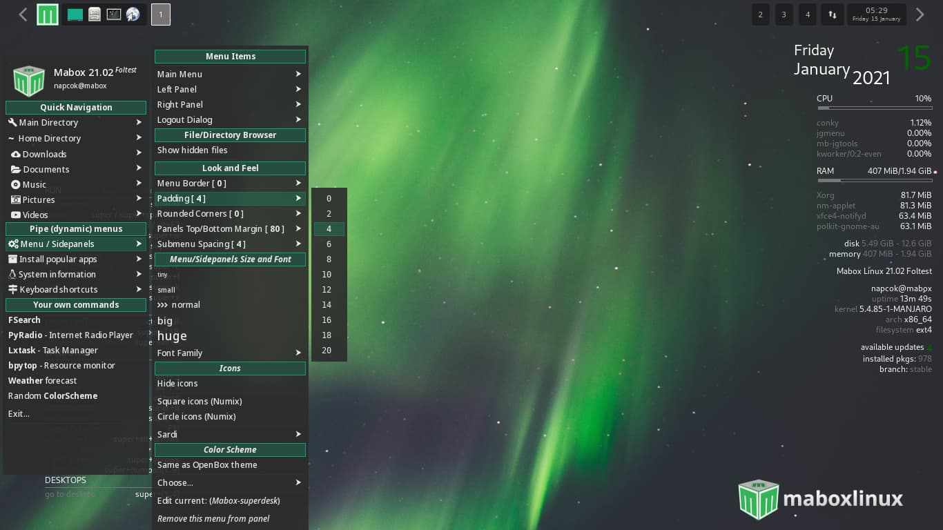
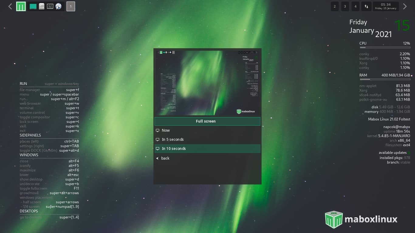
After the latest menu updates the settings menu looks a bit strange. I could not make a screenshot because of the menu displayed so I took a picture with my phone, hence the poor quality.
You can see there is a lot of free space on top of the menu.
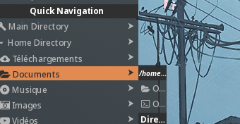
Additional, on the left menu (CTRL+Tab), the music folder is not expanded properly (I can only see a part of the intended menu text and on the EXIT menu the space between the headerlabel (EXIT) and the top is filled with (what I believe) a 3d Mabox logo and a partial screenshot? Not the sample picture of the desktop like before, it’s really ugly!
Thanks for mabox, it’s very cool.
I have a cosmetic problem since the last update,
like Bootz the music folder is not expanded properly and it’s the same with
the documents folder.